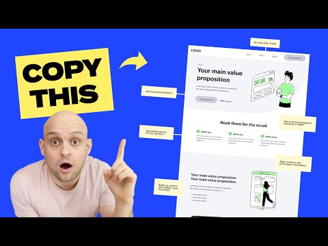
Selecting the right urban website layout is a crucial decision for any city planner, urban developer, or community organizer aiming to create an engaging online presence. A well-designed layout can significantly enhance user experience, by providing easy navigation and showcasing the most important aspects of urban life. It is important to consider the balance of aesthetics, functionality, and branding to ensure the website serves its intended purpose effectively. For urban-centered sites, this may involve highlighting community events, local landmarks, or important civic information in a way that’s accessible and appealing.
Understanding the essentials of website layout design is the bedrock of developing a functional and visually appealing urban website. Each layout must be tailored to the unique brand and demographics it serves, taking into account how visitors will interact with the website. Consideration of the technical aspects is also paramount — ensuring that the site is responsive and performs well across various devices, from desktops to smartphones is essential. Moreover, the navigation structure must be intuitive to guide visitors effortlessly through the content.
Key Takeaways
- Effective urban website layouts enhance user engagement by balancing aesthetics, functionality, and branding.
- Customization of the website layout is key to meeting the specific needs of the city’s brand and user demographics.
- Technical performance and intuitive navigation are essential components of a successful urban website layout.
Understanding The Basics Of Website Layout Design
Before we dive into specifics, it’s essential to grasp that a well-structured website layout ensures usability and aesthetics are in harmony, guiding users effectively through content.
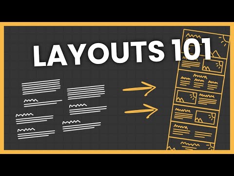
The Role Of Grids In Web Design
Grids are the backbone of any effective web design layout. They provide a systematic framework that helps us organize content logically and consistently across different pages. Utilizing a grid layout is akin to having a map; it tells us where to place elements to maintain structure and balance. For instance, a columnar layout can direct the reader’s eyes in a specific flow, making information consumption intuitive and efficient.
The Importance Of Visual Hierarchy
Visual hierarchy commands the viewer’s attention and dictates the order in which they process information. By manipulating size, color, contrast, and placement on the grid, we create focal points that lead our audience’s gaze to the most crucial information first. This hierarchy is what makes a user stay on a page – it’s the difference between a fleeting glance and a meaningful engagement with the design layout. For example, larger, bolder titles grab attention before subtler, smaller text, guiding a user’s journey through our content.
Exploring Common Website Layouts
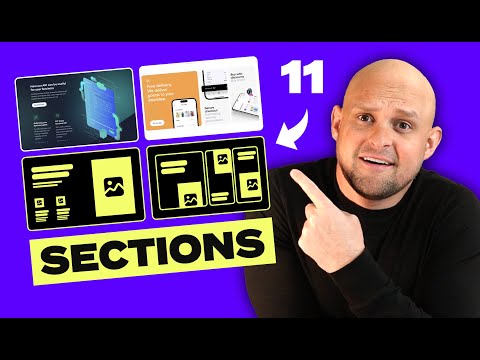
When selecting a website layout, we must consider user engagement and the content presentation that best supports our urban project’s goals. Each layout option offers a distinct user experience and aesthetic appeal.
Magazine And Card Layouts
Magazine layouts are optimized for content-rich websites. We see this format often in news portals and blog pages where information is grouped into categories, making it easy to scan and select articles of interest. Magazine layouts provide an editorial feel with a mix of photography, headlines, and teaser content.
In contrast, card layouts present content in a grid of cards, ideal for websites needing a clean, organized look. Each card typically holds an image, a brief summary, and a call to action, which is perfect for portfolio pieces or product listings.
Full-Screen And Split-Screen Layouts
Full-screen layouts are impactful, employing large images or videos to capture attention immediately. This design is perfect for storytelling and creating an immersive user experience where the content leaps off the screen.
Meanwhile, split-screen layouts divide the screen into two significant sections, often for dual messaging. We often use this for contrasting two products, services, or viewpoints, making a clear distinction yet keeping them reachable within the same space.
Single-Column And Fixed Sidebar Designs
We benefit from single column layouts because of their simplicity and focus on content. This no-fuss design works well for long-form content where we want readers to progress without distraction, making it a mainstay for blogs and editorial sites.
Fixed sidebar designs offer a balance between navigation and content. The sidebar remains in place as users scroll, providing constant access to menus or additional information, which can enhance usability and improve the overall content absorption on the site.
Designing For User Experience
When designing an urban website, we focus on ensuring that the layout is user-friendly and intuitive. The goal is to cater to user behavior while maintaining visual elements and consistency across devices. Let’s look at how we can optimize for mobile devices, create an engaging content hierarchy, and employ design techniques that boost user engagement.
Optimizing For Mobile Devices
With the increasing use of mobile devices, it is essential for us to design with a mobile-first approach. We ensure that our websites are responsive and user-friendly on smaller screens. The visual elements should be easily viewable, and clear navigation is crucial. Recognizing that mobile users seek quick information, we streamline content to make it more accessible on the go.
- Responsive Design: Utilize flexible grids and images that adapt to any screen size.
- Touch Targets: Make interactive elements large enough for touch navigation.
- Load Times: Optimize images and scripts to speed up page loads on mobile networks.
Creating Engaging Content Hierarchy
An engaging content hierarchy helps users find information quickly and easily, enhancing user engagement. We prioritize content based on user behavior and objectives, clearly distinguishing between different sections and elements for a seamless experience.
- Headers and Subheaders: Use these to guide users through the content logically.
- Bullet Points and Numbered Lists: Break down information for digestibility.
- Consistency: Maintain a consistent layout to help users predict where to find information.
Design Techniques For User Engagement
To foster user engagement, we incorporate interactive features and compelling layouts. These components invite users to interact with website content and help increase the time spent on our sites.
- Call-to-Action Buttons: Strategically placed to guide users toward desired actions.
- Images and Videos: Utilize high-quality media to capture attention and convey messages quickly.
- Feedback Forms: Encourage user participation and collect valuable insight into user preferences.
By following these design principles, we craft websites that are not only visually appealing but also highly functional and user-centric.
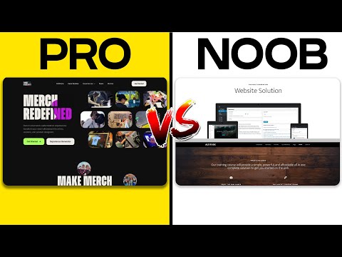
Selecting The Appropriate Layout For Your Brand
Before diving into specific strategies, it’s vital to understand that the right website layout serves as the digital embodiment of your brand’s identity. It must be thoughtfully crafted to resonate with your target audience and reinforce the brand image you intend to project.
Aligning Layout With Brand Identity
When we discuss aligning the layout with our brand identity, we focus on ensuring that the website’s structural design echoes our brand’s core values and message. For instance, a brand emphasizing innovation should consider a layout featuring dynamic elements such as interactive infographics or an unconventional grid structure. Contrastingly, a brand with a classic appeal might prefer a traditional layout with a clear hierarchy and clean lines. Effective alignment bolsters recognition and strengthens brand presence.
Utilizing Color Schemes And Imagery Effectively
Color schemes and imagery are not merely decorative elements; they play pivotal roles in conveying the emotional tone of our brand. The color scheme we choose should be consistent with the psychological associations our brand wants to elicit. For instance, green often represents growth and vitality, making it a prime choice for health or sustainability-focused brands. Meanwhile, imagery should be high-quality and relevant to our brand’s narrative, whether it’s product photography or thematic illustrations. Both color and imagery should work synergistically to create an immersive brand experience.
Key Elements Of Website Navigation
In our efforts to create effective urban website layouts, we understand the critical role of navigation. It shapes the user experience by guiding visitors seamlessly through the information architecture.
Menus And Call To Actions
Our navigation menus serve as the backbone, providing clear pathways to vital sections of our website. Strategic placement and consistency across pages enable users to find what they seek swiftly. The call to action is our directive force. It compels users to engage further, whether to contact us, learn more, or make a purchase. A powerful call to action stands out with contrasting colors, bold typography, or distinctive shapes, ensuring it captures attention without overwhelming the main navigation.
Enhancing Readability With White Space And Typography
We leverage white space to enhance readability, creating a visual breathing room around text and separating menu items. This not only declutters the layout but also emphasizes the content we want users to notice. Our choice of typography influences readability as well. Selecting clear fonts and appropriate sizes ensures legibility, guiding users through the navigation with ease. Effective typography and white space together lead to a harmonious, user-friendly interface that reflects the urban character of our websites.
Technical Aspects Of Website Layouts
Effective website design hinges on technical elements that ensure usability and aesthetic appeal. As we outline crucial aspects of urban website layouts, we focus on how responsive design ensures seamless cross-device experience and the role of A/B testing in refining user interfaces.
Responsive Design And Cross-Device Compatibility
When we talk about responsive design, it is essential to consider the fluidity with which a website adapts to various devices. Urban websites often cater to a diverse audience that accesses content on an array of devices, from smartphones to desktop computers. Wireframes are a designer’s blueprint and should account for this versatility early in the layout process. Our aim is to ensure that elements like the navigation bar are accessible and functional, regardless of the screen size. E-commerce platforms, in particular, cannot afford to ignore responsive design without risking lost conversions on mobile devices.
A/B Testing And User Interface Adjustments
A/B testing is a systematic method we employ to improve our user interface by comparing two versions of a webpage against each other. It’s more than just changing button colors; it’s about understanding how layout changes affect user behavior. By testing elements such as calls to action and menu layouts, we can gather data-driven insights that inform design decisions. A/B testing helps ensure that any adjustments to the user interface are substantiated by actual user preferences, leading to a more intuitive and effective urban website.
Layout Strategies For Specific Website Types
When we design websites, it’s crucial to adopt layout strategies that align with the site’s purpose and target audience. Tailoring the layout ensures optimal user engagement and functionality. Let’s explore the specific strategies that suit different types of websites.
E-Commerce Sites And Portfolio Websites
For e-commerce sites, the user’s journey from product discovery to checkout must be seamless. We favor grid layouts that showcase products effectively. Here’s what we consider in our design:
- Visibility: We ensure high visibility for key products and offers using prominent banners.
- Navigation: Clear and accessible navigation with a sticky menu helps users explore categories without hassle.
- Checkout Ease: A simplified checkout process with minimal steps is crucial.
For portfolio websites, our approach is to let the work take center stage:
- Whitespace: Ample whitespace helps highlight each project, preventing visual clutter.
- Gallery Layout: We use gallery layouts or sliders to let visitors explore work samples with ease.
News Sites And Personal Websites
News websites require a layout that facilitates information delivery and updates:
- Content Hierarchy: We prioritize content with a clear hierarchy, showcasing breaking news prominently.
- Infinite Scroll or Pagination: Depending on content volume, we choose between infinite scroll for continuous reading or pagination for organized sections.
Our layout for personal websites focuses on personality and user connection:
- Personal Branding: We integrate personal branding into the design, with a focus on fonts, colors, and imagery.
- Content Structure: A straightforward content structure helps users navigate through personal stories, biography, and any professional portfolio.
Conclusion
When selecting the proper layout for an urban-focused website, we need to consider several critical factors that impact not only aesthetic appeal but also functionality and user experience. Our primary goal is to ensure that the layout aligns with the urban theme and caters to the target audience’s preferences.
Here are the main aspects we’ve covered:
- Simplicity: Opt for a clean design that makes navigation intuitive.
- Visual Hierarchy: Create a focal point for key information using size and color contrast.
- Mobile Responsiveness: Ensure the site is accessible across various devices.
- Content Layout: Choose a structure that highlights urban features and news.
- Loading Speed: Implement a layout optimized for quick load times.
Incorporating social media technology and user-generated content can also encourage engagement and authenticity as seen in the study on urban creativity and placemaking strategy in Taiwan. Remember, the right urban website layout serves as a digital gateway, bringing the vibrancy and dynamism of the city to users everywhere.
To cap it off, we must always stay informed about new frontiers in online trust, as the design and functionality of our website contribute to how consumers perceive credibility, as discussed in the research on online trust.
By adhering to these elements, we craft an urban website that is not only visually compelling but also highly functional—a platform that serves as a true reflection of the urban lifestyle that we aim to represent.

